FaciliWorks’ graphs permit you view information in several different formats. These features allow you to see comparisons and trends regarding asset downtime, inventory value, and maintenance hours required or expended and estimated or expended costs. All of these graphs can be viewed on-screen, printed or emailed.
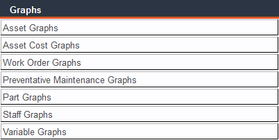
From the Main Menu, click Graphs. A list of graph categories will appear. Click a graph category and beneath it, a list of graph titles will appear. Click the desired graph title.
As with reports, the selection of a graph will open a filter that allows you to define the group of records you want to analyze. These filters work in the same way as the report filters, allowing you to create specific representations of your maintenance costs and activities.
The filter options will vary depending on the graph you’ve chosen to view. You can filter by date, Asset ID, Task ID, Asset Type, Current Location, Description, Staff ID, etc. To view all records within your chosen graph, leave all filter fields blank. Use the Clear Filter button to clear all field contents.
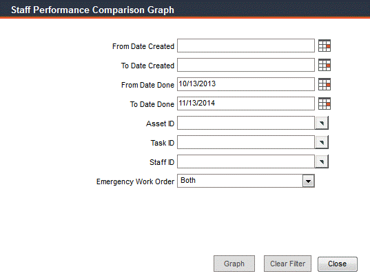
When you’re ready to view your graph, click the Graph button.
Now that you can see your graph, select a style from the Graph Style drop-down list:
Horizontal - horizontal bar graph
Vertical - vertical bar graph
Line - single line graph
Area - area representation graph of a series of points
Click the 3D checkbox to view a three-dimensional graph. Click the Gradient checkbox to see your graph on a gradient background; uncheck this box for a white background.
Some graph options will generate multiple graphs, such as Staff Performance Comparison, i.e., one graph per staff member. Use the record navigation bar to view all generated graphs.
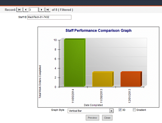
Click Preview to see a print preview of your graph in a separate window. From that window, you can print your graph (or print to a file in order to email). Close the preview window to return to FaciliWorks.
Click Close to close the graph and return to the filter.
Graph Titles, Descriptions and Special Filtering Options
Asset Downtime: This graph shows the downtime for a single asset and a corresponding task for a specified time period. Filter by either the date of creation or date of completion of the applicable work orders. Use this graph to determine whether an asset’s downtime for a particular task has increased or decreased during the specified time period. If the filter finds two or more records that fit your filter criteria, you’ll see individual graphs for each asset and task matching the criteria.
Asset Costs by Type: Shows cumulative costs. If you update your asset records with current replacement costs, this graph will give you an accurate summary of original and replacement costs by asset type.
Asset Costs within Type: Original and replacement costs for assets, sorted by type.
Asset Fuel Cost: Charts the fuel costs of your asset over a period of time. You can filter for a single asset or leave the filter blank to view costs for all assets.
Asset Fuel Distance per Unit: Shows fuel consumption for specified units on the day it was consumed.
Asset Oil Cost: Charts the oil costs of your asset over a period of time. You can filter for a single asset or leave the filter blank to view costs for all assets.
Asset Tire Cost: Shows tire consumption over a period of time.
Asset Oil Distance per Unit: Shows oil consumption for specified units on the day it was consumed.
Asset Tire Distance per Unit: Tire consumption for specified units on the day it was consumed.
Asset Other Cost: Other costs (costs aside from fuel, oil and tires) over a period of time.
Asset Other Distance per Unit: Shows other consumption for specified units on the day it was consumed.
Work Order Cost: Compares labor, contract, part and total costs filtered by date, asset, task, technician or location. FaciliWorks creates a separate work order cost graph for every Asset ID and Task ID that meets the selected criteria for easy comparison. Generate the same set of graphs twice, once with emergency work orders and once with non-emergency work orders to compare the difference in cost.
Asset Work Order Length: Compares estimated and actual task time. FaciliWorks creates a separate graph for each Asset ID and Task ID that meets the selected criteria for easy comparison.
Work Order Length by Technician: Shows the total amount of time each technician spent on work orders during a specific time period. You can filter for a time period of work order creation or completion. Leave the Staff ID field blank to see a separate graph for each technician who performed a work order during the specified date range.
Work Order Schedule: For any time period you select, this graph shows all work orders that are due, whether they are scheduled work orders, unscheduled work orders or service requests. Frequent viewing of this graph alerts you to excessive unscheduled maintenance or service requests.
Cost Center Total Downtime: Charts each cost center’s total downtime. You can filter by date range, asset or task ID, type, cause, asset description, location, technician, emergency work order status and scheduled and/or unscheduled status.
Cost Center Average Downtime: Shows each cost center’s average downtime. You can filter by date range, asset or task ID, type, cause, asset description, location, technician, emergency work order status and scheduled and/or unscheduled status.
Cost Center Downtime Comparison: Compares each cost center’s total downtime, average downtime and total number of work orders. You can filter by date range, asset or task ID, type, cause, asset description, location, technician, emergency work order status and scheduled and/or unscheduled status.
Asset Type Total Downtime: Shows total downtime for each asset type. You can filter by date range, asset or task ID, type, cause, asset description, location, technician, emergency work order status and scheduled and/or unscheduled status.
Asset Type Average Downtime: Shows average downtime for each asset type. You can filter by date range, asset or task ID, type, cause, asset description, location, technician, emergency work order status and scheduled and/or unscheduled status.
Asset Type Downtime Comparison: Compares total downtime for each asset type, average downtime and total number of work orders. You can filter by date range, asset or task ID, type, cause, asset description, location, technician, emergency work order status and scheduled and/or unscheduled status.
Work Order Cause Total Downtime: Shows total downtime for each work order cause. You can filter by date range, asset or task ID, type, cause, asset description, location, technician, emergency work order status and scheduled and/or unscheduled status.
Work Order Cause Average Downtime: Shows average downtime for each work order cause. You can filter by date range, asset or task ID, type, cause, asset description, location, technician, emergency work order status and scheduled and/or unscheduled status.
Work Order Cause Downtime Comparison: Compares total downtime for each work order cause, average downtime and total number of work orders. You can filter by date range, asset or task ID, type, cause, asset description, location, technician, emergency work order status and scheduled and/or unscheduled status.
Technician Total Downtime: Shows total downtime for each technician. You can filter by date range, asset or task ID, type, cause, asset description, location, technician, emergency work order status and scheduled and/or unscheduled status.
Technician Average Downtime: Average downtime for each technician. You can filter by date range, asset or task ID, type, cause, asset description, location, technician, emergency work order status and scheduled and/or unscheduled status.
Technician Downtime Comparison: Compares total downtime for each technician, average downtime and total number of work orders. You can filter by date range, asset or task ID, type, cause, asset description, location, technician, emergency work order status and scheduled and/or unscheduled status.
Scheduled vs. Unscheduled: Compare scheduled work orders and unscheduled work orders by asset. The graph on the left shows the total quantity of work orders; the graph on the right shows work orders by percentage. Each asset is represented by its own set of graphs. Use the record navigation bar to advance through the graph sets.
Preventative Maintenance Cost: Displays the cost of labor, contract, parts and the total cost incurred to complete a preventative maintenance order.
Preventative Maintenance Work Length: This is a graphical representation of completed PM work length with regard to actual time and expected time. Data can also be categorized by technician.
Preventative Maintenance Work Length by Technician: Graphical representation of completed PM work length with regard to the technician who performed the preventative maintenance work.
Preventative Maintenance List: This provides a list of all PMs categorized by asset type.
Preventative Maintenance Average Downtime: Displays work orders, total downtime and average downtime with regard to an asset or task.
Preventative Maintenance Labor Hours: Shows total labor hours for all completed PMs.
Preventative Maintenance Cause Average Downtime: All assets’ downtime hours grouped by cause.
Preventative Maintenance by Type: Shows all PMs by asset type.
Preventative Maintenance Asset Type by Current Location: All asset types with PMs grouped by current location of the asset.
Inventory Value by Category: Compares the inventory value of part categories. Filter to graph a single category or leave the filter blank to look at all categories. Ten categories are shown per graph; advance through all graphs using the record navigation bar.
Purchase Orders by Supplier: Compare the costs of received and backordered parts for a particular period of time. You can compare parts purchased during the current and previous months or during the same month one year ago. You can choose to see only received parts, parts you haven’t received or both. FaciliWorks creates a separate graph for each supplier.
Purchase Orders by Part: Shows information about a particular part that is supplied by more than one supplier. You can compare current and previous costs for the same part for different time periods to determine cyclical requirements, increased usage or increased cost.
Frequent use of this graph can alert you to excessive backorders that can affect your business. Each part has its own graph showing the amount spent on each part during the time indicated. You can filter the data by Ordered By or Approved By criteria, by supplier code or by parts received.
Staff Performance: Compares the amount of time that different employees spent on the same task during the same time period. You can also compare how much time the same task took for different assets. Compare emergency work order time by Asset ID, Task ID or employee.
Craft Performance: Shows craft performance comparisons for a period of time.
Staff Performance Comparison: Use this graph to compare employee performance; generate graphs for more than one employee for the same Asset ID, Task ID and time frame.
Variable History by Task: Shows the history of a selected variable; a separate graph is generated for each asset and each task. You can then see asset trends and predict when readings will be out of tolerance.
Variable History by Variable: Use this graph to track the history of a selected variable as it applies to all assets and tasks. You can see trends and overall reliability and decide if changes need to be made to improve reliability.